Effective OOH design and best practices

The job of any advertisement is simple: to catch someone’s attention in a brief moment and get them interested in your brand. But perhaps no form of advertising is under as much pressure to grab attention as quickly as possible as out-of-home (OOH). While OOH advertisements on transit shelters may give people a leisurely amount of time to peruse your ad as they wait for a bus, a billboard may only have five seconds to catch someone’s eye as they whiz by at 70 miles per hour. Read on for OOH design and best practices.
So, the stakes of OOH advertising are high. Your ad must be able to make its mark at high speeds, or you risk wasting your precious advertising dollars. But we’ve all seen impressive, memorable billboards, so we know it’s doable – what’s the secret formula?
It’s no secret at all. In fact, by following just a few straightforward guidelines, your billboards will stand out and make an impact in no time. Here are some simple principles for effective OOH design and best practices:
OOH design and best practices: Keep it simple
If you take one lesson from this article, let it be this: your design will need to be legible from far away, and potentially at high speeds, so pick one idea and stick with it! You only have mere seconds to make your impression. The simpler your message, the better.

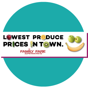
That doesn’t mean, of course, that you can’t have fun with it – billboards in particular offer unique opportunities to get creative with design and even the shape of your ad. (Think of billboards where the words or image go outside the bounds of the board itself.) But always keep in mind that the more elements you add to your design, the longer it could take for your message to get across. The last thing you want is for a potential client to drive away confused or frustrated that they weren’t able to receive your message. That could turn them off from your brand entirely.
OOH design and best practices: Keep it bold
Remember that even the simplest, most pared-down ad won’t be effective if it doesn’t have enough contrast! You don’t want anyone to have to strain to read your message, so OOH ads aren’t the place for skinny fonts or subtle variations in color – no light grey text on white backgrounds here. For maximum effectiveness, think big bold text in a contrasting color. (Again, though, keep it fairly simple: unless it has strong relevance to your brand or message, this probably isn’t the place for a psychedelic mash-up of color and pattern. Your words must be readable and your design intent clear.)

And boldness isn’t just for fonts. OOH advertising provides a unique opportunity to have your brand make a big splash – quite literally, since the boards are so huge – so have fun with it! Try large, dynamic images, and bright, bold, contrasting colors. Remember: the more your design can evoke a feeling or tell a story, the more it will stick with viewers.
A good way to test the boldness of your design is to print it out on a normal sheet of paper and stand several feet away, across the room: can you still read your text? Is the message understandable, and are the visuals clear? Are your colors harsh or clashing from a distance? Don’t forget to ask other people to take a look, and make sure they get the message quickly. If anything looks too small or too muddled, it’s time to adjust.
OOH design and best practices: Keep it short
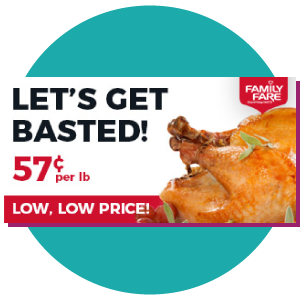
What do “Eat Fresh,” “I’m Lovin’ It,” and “Just Do It” have in common? Simply put – they’re short and to the point. “Less is more” may be a cliché, but this is one situation in which it couldn’t be more true! You can come up with the cleverest ad copy in the world, but if it’s not quickly and easily readable as people speed by in their cars, it’s not going to do you any good. Save long sentences and paragraphs for your website. While this can’t necessarily work for every single OOH ad, a good rule of thumb is to keep your copy to seven words or less. Remember: short copy sticks.

This is also an opportunity for you to have fun with the design. If you want to keep your words to a minimum, let the imagery do the talking. You may not be able to fit a thousand words on your billboard, but a strong image is worth just as much!

It can be so tempting to load up your ad with words – after all, how else can you communicate the time, place, and purpose of your event, for example? But with the magic of the internet, you don’t have to. One easy way to cut down on words is to direct people to a short URL that will tell them what they need to know. So instead of cluttering your limited billboard space with the name, place, date, URL, and time of your event (not to mention the design!), you can grab their attention with a brief title, date, and short URL, and interested people can learn the rest on your website. Bonus? If you make a unique URL used only on your billboard, you can also use that to track the effectiveness of your ad. (For more information on combining traditional and digital advertising methods, check out our article on how they can work together!)
Designing effective OOH advertising may seem like a tall task. But if you follow our OOH design and best practices by keeping your design simple, bold, and short, you’ll be well on your way to eye-catching ads!


